

Table of Contents
ToggleAn interior design guide can transform how people approach decorating their homes. Good design isn’t about following trends or spending a fortune, it’s about understanding a few key principles and applying them with intention. Whether someone is starting from scratch or refreshing an existing room, these fundamentals make the difference between a space that feels “off” and one that feels just right.
This guide breaks down the essential elements of interior design: color, furniture arrangement, lighting, and texture. Each section offers practical strategies that anyone can use. No design degree required.
Key Takeaways
- A successful interior design guide focuses on five core principles: balance, proportion, rhythm, emphasis, and harmony to create cohesive spaces.
- Use the 60-30-10 color rule—60% dominant color, 30% secondary, and 10% accent—to build a balanced and visually appealing palette.
- Pull furniture away from walls and maintain 30-36 inches of clearance in pathways to improve flow and make rooms feel larger.
- Layer three types of lighting—ambient, task, and accent—to achieve both functionality and atmosphere in every room.
- Mix textures like smooth leather, nubby wool, and natural materials to add depth and prevent spaces from feeling flat.
- Edit ruthlessly: every object should earn its place, and personal touches make an interior design feel authentic rather than staged.
Understanding the Core Principles of Interior Design
Every great interior design guide starts with the basics. These core principles form the foundation of any well-designed space.
Balance refers to the visual weight distribution in a room. Symmetrical balance uses matching elements on either side of a central point, think two identical lamps flanking a sofa. Asymmetrical balance achieves equilibrium through different objects of similar visual weight. A large armchair might balance a grouping of smaller side tables and plants.
Proportion and scale matter more than most people realize. A massive sectional sofa in a small living room overwhelms the space. A tiny coffee table in front of that same sectional looks lost. Furniture should relate to the room size and to each other.
Rhythm creates visual flow. Repeating colors, patterns, or shapes throughout a room guides the eye naturally from one area to another. A throw pillow color might echo in artwork across the room, then appear again in a vase on a shelf.
Emphasis gives every room a focal point. This could be a fireplace, a statement piece of furniture, or a bold piece of art. Without emphasis, rooms feel flat and unfocused.
Harmony ties everything together. All elements should feel connected, even when they’re different styles or eras. A cohesive interior design plan creates unity without boring uniformity.
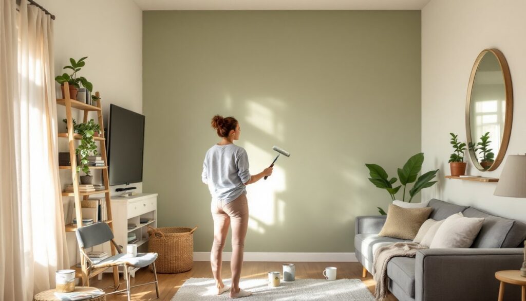
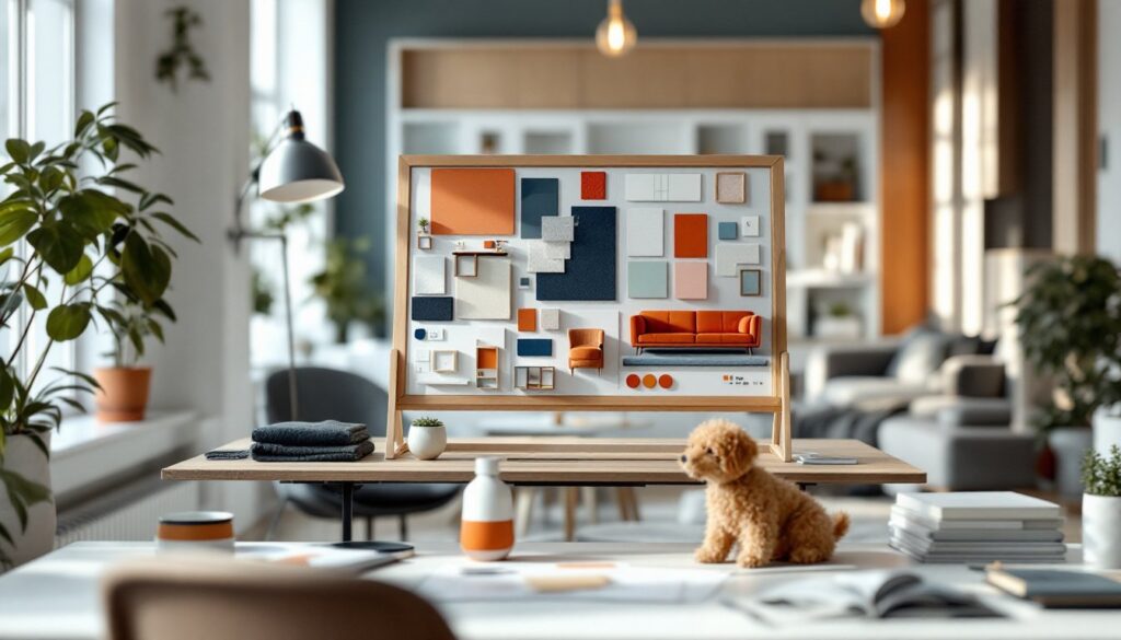
Choosing a Color Palette That Works
Color sets the mood for any interior design project. The right palette can make a room feel larger, cozier, more energetic, or more calm.
The 60-30-10 rule offers a reliable starting point. Sixty percent of the room features the dominant color, usually walls and large furniture pieces. Thirty percent goes to the secondary color, appearing in curtains, accent chairs, or area rugs. The remaining ten percent adds pops of accent color through accessories, pillows, and art.
Warm colors (reds, oranges, yellows) energize a space and make large rooms feel more intimate. Cool colors (blues, greens, purples) create calm and can make small rooms appear more spacious. Neutrals provide flexibility and longevity.
An interior design guide wouldn’t be complete without mentioning undertones. That gray paint might lean blue, green, or purple depending on its undertone. Test paint samples in actual room lighting before committing. Colors shift dramatically between natural daylight and artificial evening light.
For those unsure where to start, pulling colors from a favorite piece of art, a rug, or even a fabric swatch simplifies decisions. Nature-inspired palettes also tend to work well, think forest greens with warm browns, or ocean blues with sandy neutrals.
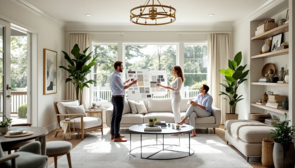
Furniture Arrangement and Space Planning
Good furniture arrangement serves both function and aesthetics. A room can have beautiful pieces and still feel awkward if they’re placed poorly.
Start with traffic flow. People should move through a space easily without squeezing between furniture or walking around obstacles. Main pathways need at least 30-36 inches of clearance.
Create conversation areas. In living rooms, seating should face inward toward a central point. Sofas and chairs positioned too far apart make conversation difficult. The ideal distance between seats is about 8-10 feet.
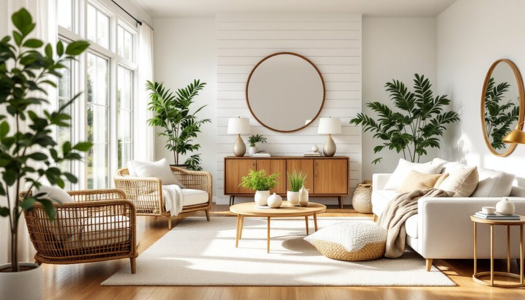
Pull furniture away from walls. This interior design tip surprises many people, but floating furniture, even just a few inches from the wall, creates better flow and makes rooms feel larger. It also allows for design elements like console tables or floor lamps behind sofas.
Anchor with area rugs. Rugs define zones within open floor plans. All furniture legs should sit on the rug, or at minimum, the front legs of major pieces. A too-small rug makes everything look disconnected.
Consider sight lines. What does someone see when entering the room? When sitting on the main sofa? The best interior design arrangements account for views from multiple angles.
Measure twice, arrange once. Tape out furniture dimensions on the floor before purchasing to avoid expensive mistakes.
Layering Lighting for Function and Ambiance
Lighting transforms spaces more than almost any other element. A single overhead fixture rarely provides adequate or attractive illumination. Every interior design guide emphasizes the importance of layered lighting.
Ambient lighting provides overall illumination. This includes ceiling fixtures, recessed lights, and natural light from windows. It’s the base layer that allows people to see and move safely.
Task lighting serves specific activities. Reading lamps, under-cabinet kitchen lights, and desk lamps fall into this category. Task lighting should be bright enough for the activity without creating glare.
Accent lighting adds drama and highlights architectural features or artwork. Picture lights, uplights, and track lighting directed at focal points create visual interest and depth.
Most rooms need all three types. A living room might combine recessed ambient lights, table lamps for reading, and sconces highlighting a gallery wall.
Dimmer switches are an interior design essential. They allow the same room to shift from bright and functional to soft and atmospheric. Install them wherever possible.
Don’t forget bulb temperature. Warm white (2700K-3000K) suits living spaces and bedrooms. Cooler temperatures (3500K-4000K) work better in kitchens and bathrooms where task clarity matters.
Adding Texture and Finishing Touches
Texture brings depth and interest to interior design. Without it, even a well-planned room feels flat.
Mix materials intentionally. Smooth leather pairs with nubby wool. Sleek metal contrasts with rough wood. Glass surfaces balance heavy textiles. This contrast creates visual and tactile richness.
Textiles offer the easiest way to add texture. Layer throw blankets over sofas, add textured pillows, choose curtains with weight and drape. Area rugs with interesting weaves contribute both pattern and texture underfoot.
Natural elements ground a space. Wood, stone, plants, and natural fibers connect interiors to the outside world. Even small additions, a wooden bowl, a stone coaster set, fresh greenery, make a difference.
Finishing touches tell the story. This interior design principle often gets overlooked. Personal items, collected objects, books, and artwork reflect who lives in the space. Styled shelves, curated vignettes on coffee tables, and meaningful art create rooms that feel lived-in rather than staged.
Edit ruthlessly. More isn’t better. Every object should earn its place. Leave breathing room between items and resist the urge to fill every surface.