

Table of Contents
ToggleWalk into a well-designed room and you feel it immediately, a sense of calm, intention, and flow. That’s unity in interior design at work. It’s not about everything matching perfectly or following rigid rules: it’s about creating a space where each element belongs and reinforces the whole. For homeowners and DIY enthusiasts tackling decor projects, understanding unity transforms you from someone arranging stuff to someone creating a genuine environment. The good news: you don’t need a design degree to achieve it. With a few practical principles and honest decisions about color, pattern, and materials, any room can feel cohesive and welcoming.
Key Takeaways
- Unity in interior design creates a cohesive visual story through consistency in color, materials, and furniture choices without requiring everything to match perfectly.
- Overcome monotony by adding intentional variety within unity—use contrasting textures, accent colors, and shapes that echo existing elements throughout the room.
- Establish a strong color foundation using the 60-30-10 rule: one dominant color, a secondary color, and a 10% accent color while maintaining consistent undertones.
- Repetition is unity’s workhorse—repeat materials, patterns, and shapes at least three times across different elements to signal intentional design at a subconscious level.
- Unify your space through coordinated lighting finishes, layered fixtures with consistent color temperatures, and accessories that reinforce your main color palette rather than introducing new colors.
What Is Unity In Interior Design
The Core Principles Behind Design Harmony
Unity in interior design means your room tells one visual story rather than five competing ones. It’s the thread connecting your color palette, furniture choices, materials, and accessories into something that feels intentional. When unity works, a visitor enters and immediately grasps the mood: calm and minimal, warm and traditional, bold and contemporary.
The mechanic behind unity relies on consistency without monotony. Think of it like a builder framing a house, every wall, stud, and joist follows the same structural logic, but the spaces inside are different rooms serving different purposes. Your living room operates the same way: consistent design language, varied function and personality.
Unity works on several levels. Visual unity ties together what the eye sees: matching color undertones, repeated materials, proportional furniture. Conceptual unity connects the why, the room’s purpose and mood determine everything else. A home office should feel focused: a bedroom should invite rest. When those goals guide your material and color choices, unity follows naturally. Interior design for beginners doesn’t have to feel overwhelming, start by naming the room’s primary purpose, and nearly every decision becomes easier.
How Unity Differs From Monotony
Here’s the question every DIYer asks: won’t unity make my room boring? Not if you understand the difference between unity and monotony. Monotony is repetition without variation, same color, same texture, same energy everywhere. Unity is repetition with intentional variety, where differences strengthen rather than weaken the whole.
Think of a well-designed kitchen. Cabinets might be white, walls soft gray, and countertops warm wood. That’s consistent (unity), but the wood grain, cabinet hardware, and white subway tile backsplash add visual texture and interest. A monotonous kitchen would be white cabinets, white walls, white tile, and no relief, it’d feel sterile and exhausting.
Variety within unity comes from contrasting scales, textures, and accent elements. A room dominated by smooth surfaces needs a woven rug or textured wallpaper. A space heavy on warm tones benefits from a cool accent wall or cool metallic accessories. The key: changes feel like intentional choices, not accidents. Every variation should echo something else in the room, a carpet color pulling from wall tone, metal finishes matching throughout, or patterns sharing a common color family. Interior Design Trends 2026 lean heavily on this balance: cohesive base designs with bold, purposeful accents that create personality without chaos.
Using Color Schemes To Establish Unity
Color is the fastest tool for establishing (or breaking) unity. A coherent color scheme acts like a backbone, everything else hangs off it. The trick: choose a palette intentionally, not randomly.
Monochromatic schemes (one color in varying tones, think navy, light blue, and steel blue) deliver instant unity. They’re safe and soothing, though they demand texture and accent shapes to avoid flatness. Analogous schemes use adjacent colors on the color wheel (blue, blue-green, green) and feel harmonious by nature. Complementary schemes pair opposite colors (navy and orange, gray and yellow) and create energy while maintaining balance if one color dominates.
For DIY projects, start here: choose one dominant color (60% of the room, walls, large furniture), a secondary color (30%, medium pieces, accent walls), and an accent color (10%, accessories, art, trim). This ratio protects against overwhelming the space while allowing personality. Undertone consistency matters too. Warm grays pair with warm whites, warm woods, and warm metals: cool grays pair with crisp whites and chrome. Mixed undertones feel scattered.
When selecting paint or large upholstered pieces, test samples in actual room light at different times of day. Lighting changes perceived color dramatically. A gray that looks elegant at 2 PM might feel cold at 7 PM under different fixtures. House Beautiful’s paint guides offer real-room examples that show color relationships in context, far better than paint chips alone.
Repetition And Pattern: Tying Rooms Together
Repetition is unity’s workhorse. Without it, a room feels chaotic even if colors are coordinated. Repetition means the same color, material, shape, or pattern appears at least twice, ideally three times, in a space.
Repeat materials strategically. If your flooring is wood, repeat that warmth in window frames, shelving, or furniture. If you choose concrete floors, echo that industrial feel with steel light fixtures or metal shelving. If your sofa is linen, perhaps add linen curtains or linen throw pillows. The repeated texture signals intentionality.
Pattern repetition requires care. A room can handle multiple patterns, say, a striped rug, plaid pillows, and botanical wallpaper, if they share a color family and similar scale. Three small-scale prints feel chaotic: two small-scale and one large-scale pattern feel designed. Mixing pattern styles (geometric, botanical, striped) works if each returns a color present elsewhere in the room.
Repeat structural shapes too. If a mirror frame is round, add round side tables or a round pendant light. If your media console is angular and geometric, echo that in shelving or end tables. These subtle echoes tie a room together at a subconscious level, visitors feel the coherence without articulating why. Interior Design Tips emphasize this: successful rooms repeat at least one major design choice three times across different elements.
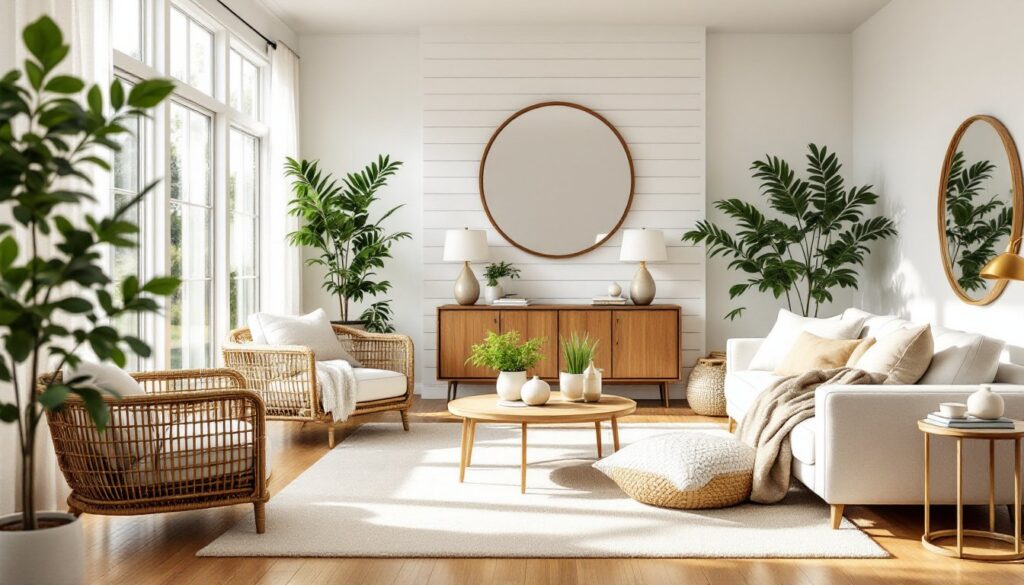
Furniture Styles And Materials For Cohesive Spaces
Mixing furniture styles is fine: mixing eras and materials without logic isn’t. A modern loft can absolutely blend a mid-century modern sofa with industrial shelving and a rustic wood coffee table, as long as they share a common thread. That thread might be: clean lines, warm wood tones, or minimalist legs.
Decide on a primary style (mid-century, farmhouse, transitional, contemporary) and let secondary pieces complement it. A farmhouse room doesn’t forbid a sleek chrome floor lamp, but that lamp should align with the room’s color and material story. A contemporary space can include a vintage rug if the rug’s colors match the wall and furniture palette.
Material consistency strengthens unity. If your room features natural wood, repeated wood tones (light oak, walnut, reclaimed pine) reinforce a cohesive feel. If it’s a metal-and-glass aesthetic, chrome, brushed nickel, and glass repeated throughout create clarity. Mixing materials works, wood and metal, fabric and leather, but limit it to 3–4 primary materials and repeat each intentionally.
For upholstered pieces, neutral frames with varied fabric colors or patterns work well. A gray sofa, navy chair, and cream ottoman feel unified through that neutral frame, while the fabrics add personality. Avoid pairing wildly different wood tones (light oak next to dark walnut) unless they’re intentionally separated, say, the sofa’s frame is dark walnut, but side tables are light oak. Top interior design resources stress that furniture layouts matter too: arrange pieces to promote conversation and flow, which strengthens the sense that a room was thoughtfully planned, not haphazardly filled.
Lighting And Accessories As Unifying Elements
Lighting is often overlooked in unity discussions, but it’s critical. Mismatched light fixtures, a chandelier, track lights, and a random pendant, create visual discord. Instead, choose a unifying finish: all oil-rubbed bronze, all brushed nickel, all matte black, or a cohesive combination like brushed nickel and clear glass.
Layered lighting (ambient, task, and accent) is standard practice, but fixtures should feel intentional together. Three pendant lights in matching styles, a flush-mount ceiling fixture, and table lamps with similar bases create harmony. Warm bulbs (2700K color temperature) feel inviting: cool bulbs (4000K+) feel clinical. Choose one temperature throughout the room to avoid spotty, disconnected lighting moods.
Accessories, artwork, pillows, rugs, plants, are where personality blooms, but they anchor unity too. A gallery wall gains cohesion from matching frames, consistent mat colors, or shared subject matter. Throw pillows on a sofa feel planned if they pull from the room’s color palette rather than introducing new colors. Plants add life and textural variety: group them by pot material or color so they feel collected, not random.
The 80/20 rule helps: keep 80% of accessories neutral or tied to your main color scheme, and use 20% for accent colors or bold pieces. This ratio allows personality without overwhelming unity. A neutral room suddenly feels intentional when a few carefully chosen art pieces or decorative objects reinforce the design story. Resources like Homedit showcase rooms where thoughtful accessorizing elevates cohesive base designs. Interior Design vs Interior Decorating clarifies this distinction: design is the bones: decorating is the finishing layer that expresses personality while respecting that foundation.
Bringing Unity Into Your Own Spaces
Achieving unity doesn’t require a complete overhaul. Start with one room and one commitment: identify your primary color, choose 2–3 secondary colors, select a dominant material (wood, metal, fabric), and decide on a mood (calm, energetic, traditional, modern). Then look at existing pieces, can they fit that story, or do they need to go? Some items might need repositioning or reframing (a mismatched picture frame painted to match your palette becomes intentional rather than accidental).
Measure and document what you have. Actual dimensions prevent poor furniture choices later. Note existing fixture finishes, if you have brass fixtures, adding more brass or warm gold feels unified: switching to chrome introduces discord.
Layering in changes over time works better than a sudden upheaval. Add one unified element monthly: repaint an accent wall, swap hardware, introduce a cohesive rug, or hang a thoughtful gallery. Interior Design Ideas often come from observation, spend time in rooms that feel good and ask why. What colors recur? What materials repeat? What mood do you absorb? Your answers become your design compass. Unified spaces aren’t accidents: they’re the result of intention, repetition, and honest choices about what belongs. Dwell features homes where that clarity is palpable, rooms that whisper rather than shout, where every piece supports the whole. That’s achievable in your home too.