
Table of Contents
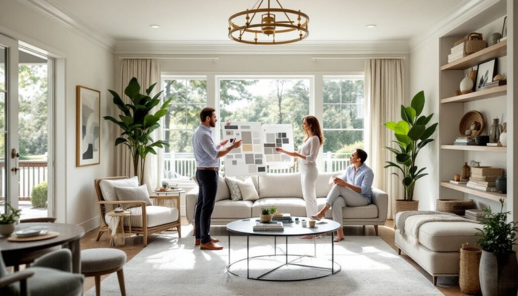
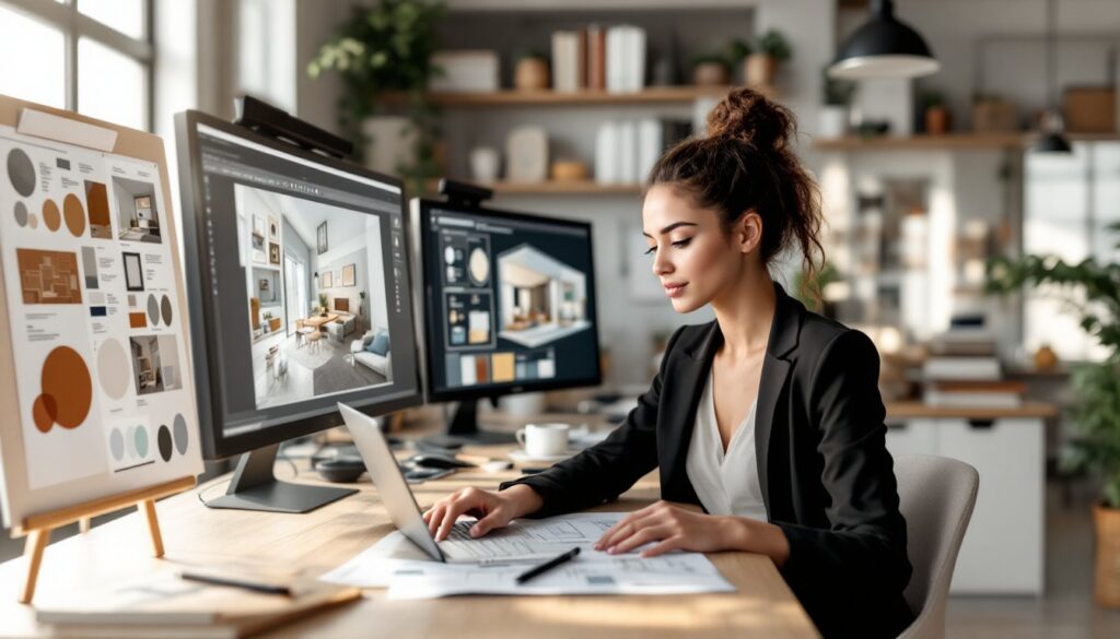
ToggleInterior design isn’t just about picking colors and arranging furniture, it’s a science that shapes how we live, feel, and move through our spaces. Most people think decorating is purely aesthetic, a personal taste thing. But the truth? Designers use proven principles that affect mood, behavior, and how functional a room actually is. Understanding these facts about interior design can transform your approach to decorating, whether you’re tackling a single room or your whole home. Let’s dig into what the experts know and how you can apply it to your own space.
Key Takeaways
- Color psychology directly influences mood and behavior—blues and greens calm spaces while reds and oranges stimulate energy, making color selection essential to a room’s function.
- The rule of thirds, placing focal points along imaginary grid lines rather than center, creates visually balanced and dynamic room layouts that feel intentional.
- Layered lighting combining ambient, task, and accent light transforms atmosphere and depth far more effectively than a single overhead fixture.
- Furniture scale and proportion should match room dimensions, with your largest piece occupying roughly one-third of wall space to prevent a room from feeling cramped or cavernous.
- Negative space is as important as furniture and decor—strategic empty areas make rooms feel larger, less cluttered, and more visually restful.
- Mixing textures using the 60-20-20 rule creates visual richness and depth while strategic texture choices enhance how light moves through your space.
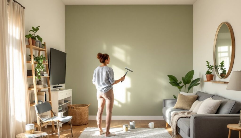
Color Psychology Actually Impacts Your Mood and Behavior
Colors aren’t just pretty, they genuinely influence how you feel and act in a room. Blues and greens calm the nervous system, which is why they’re ideal for bedrooms and bathrooms. Reds and oranges stimulate energy and appetite, making them solid choices for kitchens and dining areas. Yellows and warm neutrals foster creativity and conversation, perfect for home offices or living spaces where you gather.
The science is real. Studies show that specific wavelengths of color trigger psychological responses in the brain. A bedroom painted in muted gray-blue promotes better sleep, while a home office in soft yellow can boost focus and mood throughout your workday. When you’re selecting paint or decor, think about the room’s function first, then choose colors that support that function.
That said, personal preference still matters. If you love a bold color but it’s typically stimulating, use it in smaller doses, an accent wall or one piece of furniture, rather than covering all four walls. This gives you the emotional benefit without the sensory overload. And don’t forget that lighting changes how colors read: warm bulbs shift cool colors slightly, and daylight reveals true hue.
The Rule of Thirds Is a Game-Changer for Room Layouts
The rule of thirds is borrowed from photography and painting, but it’s a game-changer for interior design too. Imagine dividing your room into nine equal sections using two horizontal and two vertical lines. Place your focal points, a sofa, artwork, or fireplace, along these lines or at their intersections, not dead center. This simple adjustment makes a room feel more balanced and visually interesting than plopping a couch smack in the middle.
Why does it work? Our eyes naturally gravitate toward these zones rather than the center of a space. When designers use the rule of thirds, rooms feel intentional without looking staged. You’re working with how human eyes actually perceive a room, not against it. For a living room, position your main seating at a third-line intersection and angle secondary pieces nearby. For bedrooms, place the bed along one-third of the wall rather than centered, then balance with nightstands and artwork.
You don’t need a degree to apply this, just step back after arranging a room and ask yourself if the layout feels static or dynamic. If everything’s perfectly symmetrical, it’ll look formal and stiff. A little asymmetry based on the thirds principle creates rhythm and flow that draws people through the space naturally.
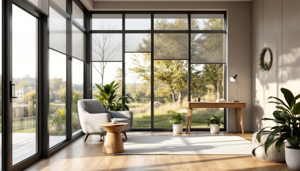
Lighting Does More Than Just Illuminate Your Space
Lighting is arguably the most underrated design element. It’s not just functional, it shapes mood, highlights architectural features, and can make or break even the most beautiful furniture and decor. Most rooms need three types: ambient (general overhead light), task (focused light for reading or cooking), and accent (directional light to highlight artwork or texture).
Warm light (around 2700K on the color temperature scale) creates coziness and is ideal for living rooms, bedrooms, and dining areas. Cool light (above 4000K) promotes alertness and works better in kitchens and home offices. Many people make the mistake of installing one overhead fixture and calling it a day. That flat, shadowless lighting drains a room of personality. Instead, layer your light: use a dimmer on overhead fixtures, add bedside lamps, place a standing lamp in a corner, and hang wall sconces flanking a mirror or artwork.
Accent lighting is where amateurs often miss an opportunity. A well-placed spotlight on a gallery wall or behind a bookcase adds depth and dimension that changes how the entire room feels. Don’t underestimate the power of a good task lamp either, it’s the difference between straining to read in poor light and actually enjoying an evening in your space. When you’re planning a room, lighting comes before furniture placement, not after.
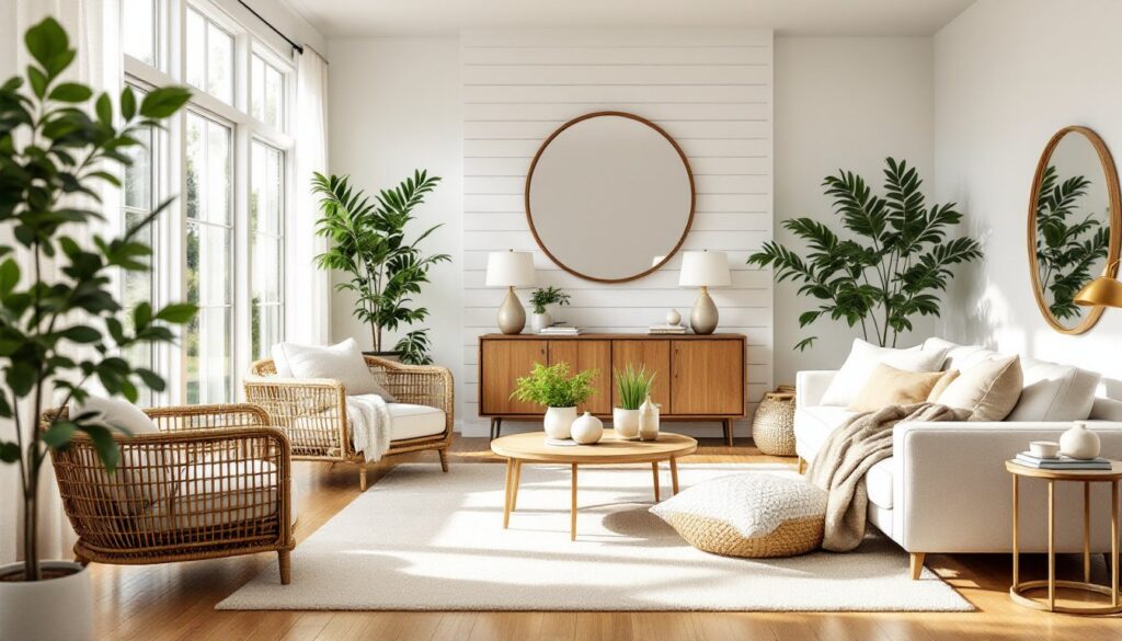
Scale and Proportion Shape How a Room Actually Feels
Scale and proportion determine whether a space feels cramped, cavernous, or just right. A huge sectional in a small bedroom will overwhelm the room and make it feel claustrophobic. A tiny loveseat in a spacious living room will look lost and insignificant. The furniture should be proportional to the room’s dimensions and to each other.
Here’s a practical rule: your largest furniture piece should occupy roughly one-third of your wall space. If your living room wall is 12 feet wide, a sofa should be around 4 feet. The coffee table in front of it should be proportional to the sofa, typically two-thirds to three-quarters of the sofa’s length. Artwork on walls should account for about 60 to 75 percent of the space above furniture. These ratios aren’t random: they’re based on how the human eye perceives balance.
Height variation matters too. Mix tall bookcases with lower seating to create visual interest and prevent monotony. If every piece is at the same height, standard sofa, standard side table, standard wall art, the room feels flat and boring. Introduce a tall floor lamp, a wall-mounted shelf, or an elevated headboard to add dimension. When you walk into a room where scale and proportion are dialed in, you’ll feel it instantly: the space breathes, flows, and feels intentional.
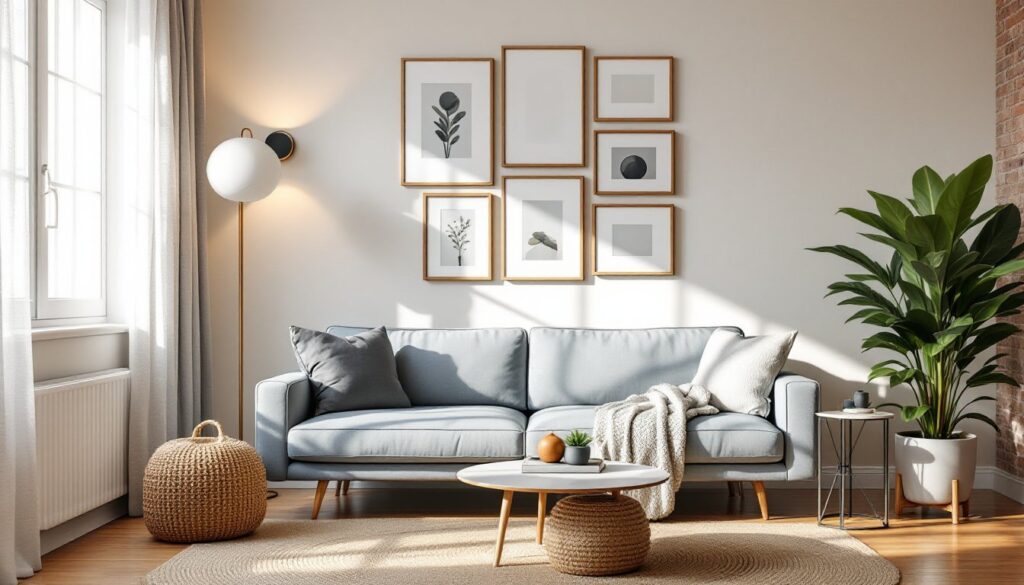
Negative Space Is Just as Important as Furniture and Decor
Negative space, the empty area between and around furniture and decor, is design real estate, not wasted space. A common beginner mistake is filling every corner, hanging art on every wall, and crowding surfaces with accessories. This clutters the eye and makes even a large room feel suffocating. Strategically leaving some breathing room is what separates a thoughtfully designed space from one that looks overcrowded.
Think of negative space as the pauses in a piece of music. Without them, the song becomes noise. Without negative space, your room becomes visual chaos. A mantel with five framed photos, three vases, and a candle is busier than a mantel with two carefully chosen pieces and some blank wall showing. An empty corner with a single tall plant and nothing else draws the eye more effectively than that same corner packed with a side table, lamp, basket, and throw blanket.
Negative space also makes rooms feel larger than they actually are. If you’re working with a compact bedroom or small living room, resist the urge to fill it completely. Leave some walls partially bare, space out your furniture with intentional gaps, and let the eye rest. This creates an airy feeling that cramming more stuff will never achieve. Interior Design for Beginners: covers how to balance fullness and emptiness for maximum impact.
Texture Creates Visual Interest and Depth in Any Room
Texture is the tactile quality of surfaces, rough, smooth, shiny, matte, and it’s essential for depth. A room with only one texture feels one-dimensional and boring. Mixing textures creates visual richness and makes a space more inviting. Pair a smooth leather sofa with a chunky knit throw, or combine sleek glass side tables with a raw linen curtain.
Common textures in interior design include:
• Soft: velvet, linen, wool, cotton, suede
• Hard: metal, glass, marble, concrete, tile
• Matte: fabric, paint, unfinished wood
• Reflective: mirrors, glass, polished metal
• Organic: wood grain, woven jute, stone, plants
A designer trick is the 60-20-20 rule for texture distribution: 60% one dominant texture (like painted drywall), 20% a secondary texture (upholstered furniture), and 20% accent textures (a woven rug, a velvet pillow, a metal lamp). This creates balance without looking chaotic. The goal isn’t to use every texture possible, it’s to use contrast strategically.
Texture also affects how light moves through a room. A shiny surface reflects light and feels modern: a matte surface absorbs it and feels cozy. Rough textures catch light and create shadows, adding depth. Smooth textures are sleek and minimal. When you’re designing a room, run your hands on materials, see how light hits them, and think about the mood you’re creating. Interior Design Trends 2026: explores which textures are trending this year.
Conclusion
These design facts aren’t complicated trade secrets, they’re proven principles that work because they’re rooted in how humans actually perceive and experience space. Color affects your mood, proportion shapes comfort, lighting transforms atmosphere, and texture adds soul. When you understand these fundamentals and apply them intentionally, your room stops looking like a collection of items and starts feeling like a cohesive, functional, beautiful space. You don’t need to be a professional designer or have a massive budget. You just need to know what works and why.